
How Color Psychology Impacts Fashion Campaigns
Color does far more than make a fashion campaign look visually appealing.
It influences emotion.
Attention.
Mood.
Perception.
Desire.
And even purchasing decisions.
Before audiences consciously process a campaign, color already shapes how they feel about the brand and the collection being presented.
That is why the strongest fashion campaigns in 2026 use color strategically — not randomly.
At Parish Mandhan Photography, we approach color as part of storytelling, not just aesthetics. Because in fashion photography, the right color palette can completely change how a campaign is emotionally experienced.
What Is Color Psychology?
Color psychology is the study of how colors influence human emotions, behaviors, and perception.
Different colors naturally create different emotional responses.
For example:
Black often feels powerful or luxurious
White can feel clean and minimal
Red creates intensity and energy
Blue communicates calmness and trust
Green feels fresh and natural
Gold suggests prestige and elegance
In fashion campaigns, these emotional associations help shape brand identity and customer perception instantly.
Why Color Matters So Much in Fashion
Fashion is deeply emotional.
People do not only buy clothing because of practicality.
They buy:
Identity
Mood
Confidence
Lifestyle
Aspiration
Color helps communicate those emotions visually before a single word is read.
That means the colors used in:
Clothing
Backgrounds
Lighting
Styling
Makeup
Set design
Editing
…all contribute to the psychological impact of the campaign.
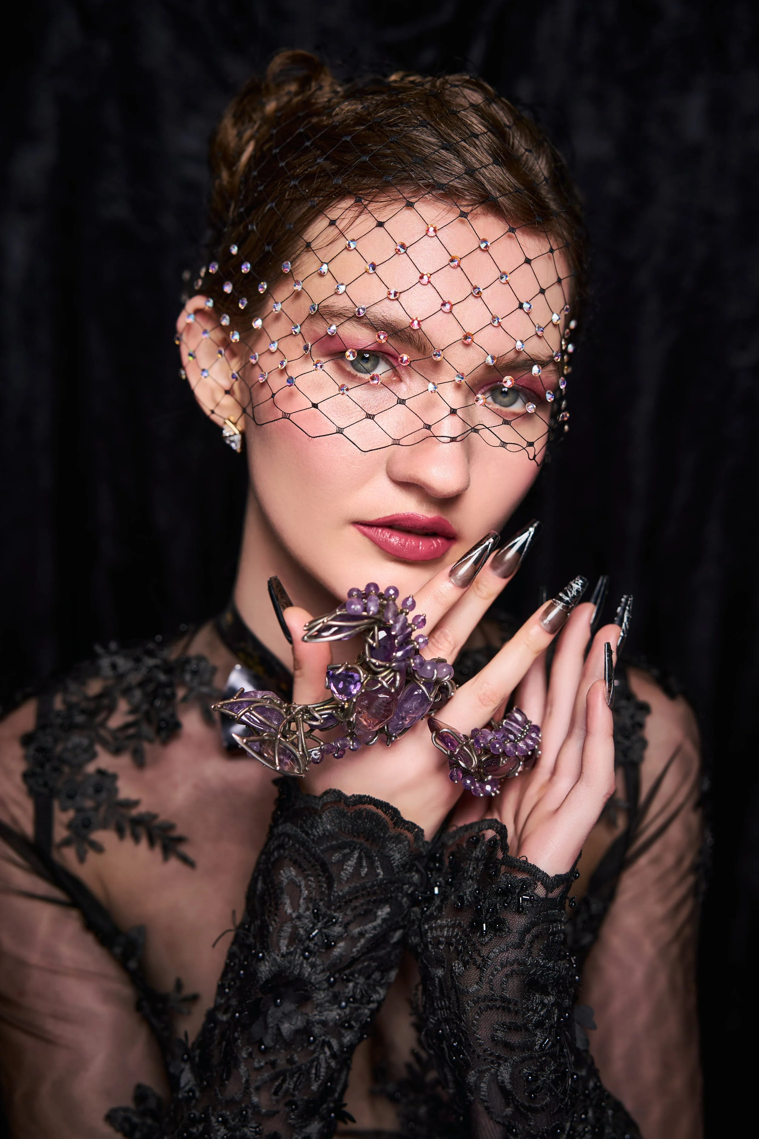
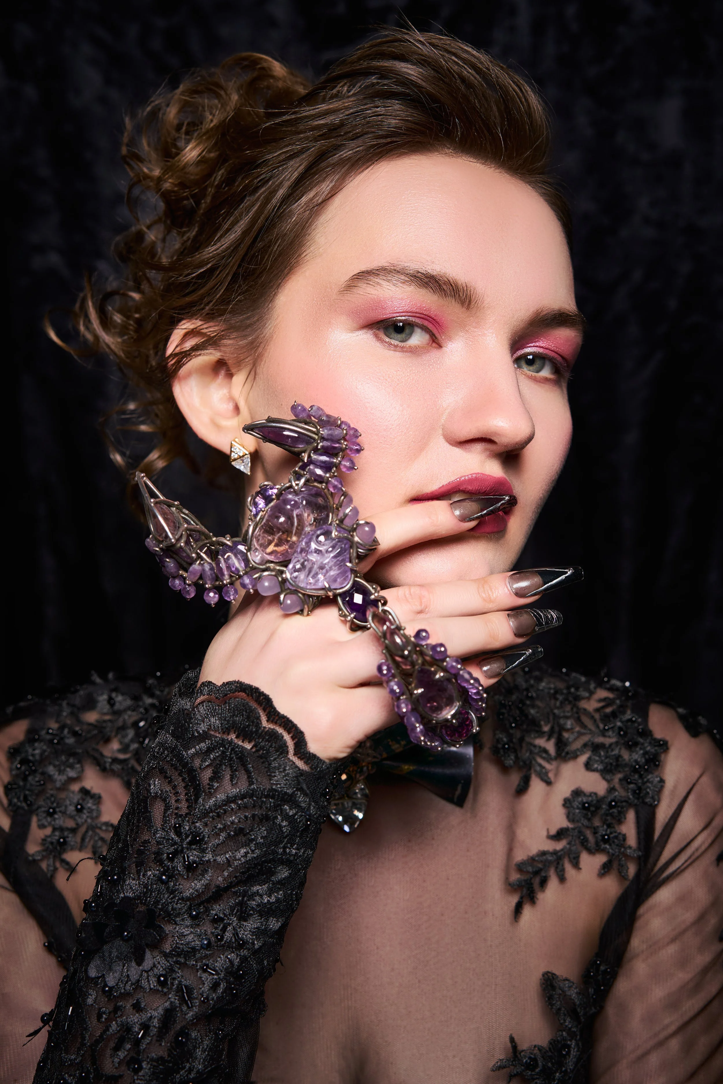
1. Black Creates Luxury and Power
Black remains one of the strongest colors in fashion branding.
It is commonly associated with:
Sophistication
Authority
Confidence
Elegance
Exclusivity
This is why luxury fashion campaigns often rely heavily on black tones, darker lighting, and monochromatic styling.
Black creates visual strength and timelessness.
At Parish Mandhan Photography, black-based editorial styling is often used to create campaigns that feel premium and fashion-forward instantly.
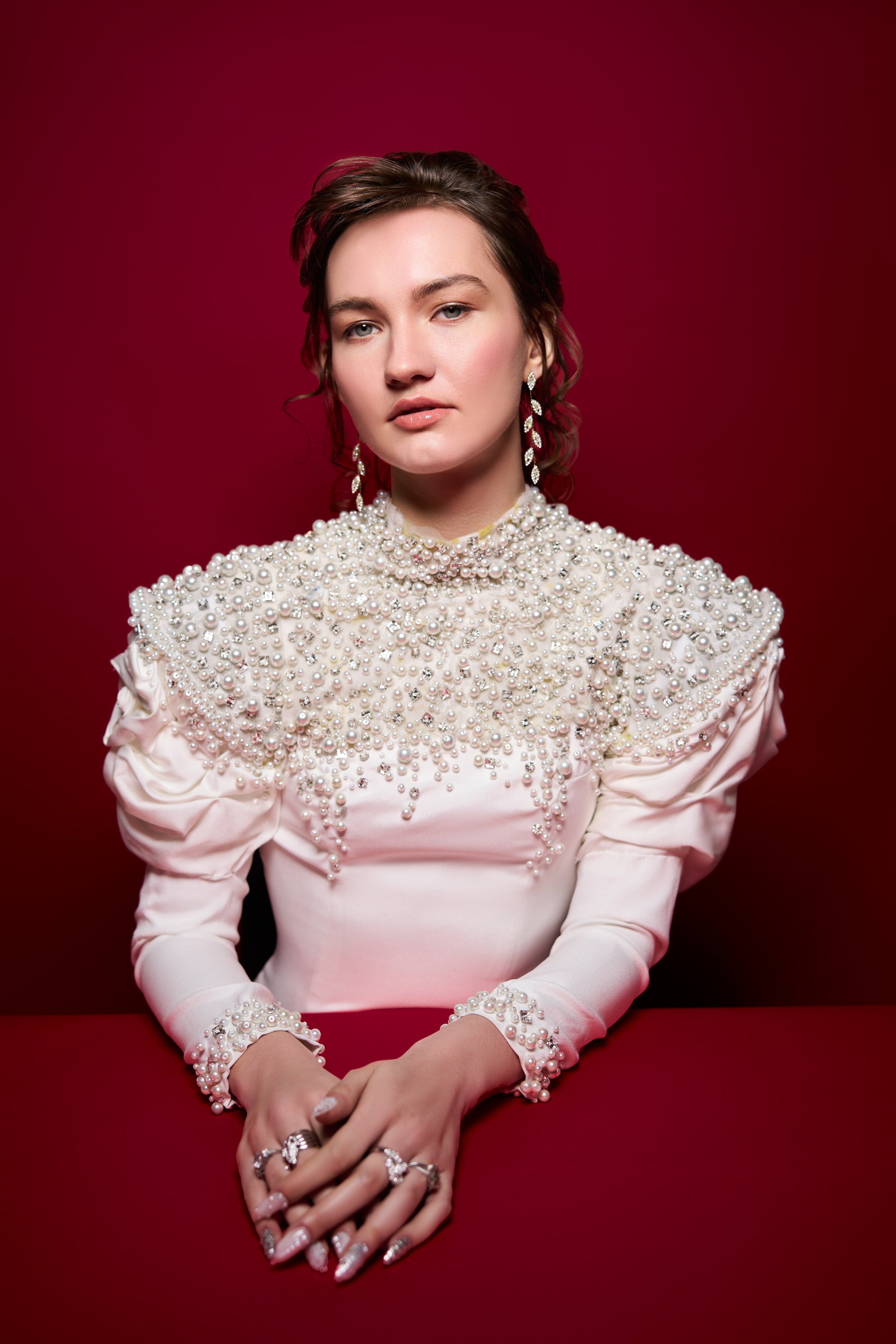
2. White Communicates Minimalism and Clean Beauty
White often represents:
Purity
Simplicity
Calmness
Freshness
Modern elegance
Beauty and skincare brands especially use white heavily because it helps products feel:
Clean
Professional
Refined
Trustworthy
In fashion campaigns, white can create a soft luxury aesthetic that feels modern and elevated.
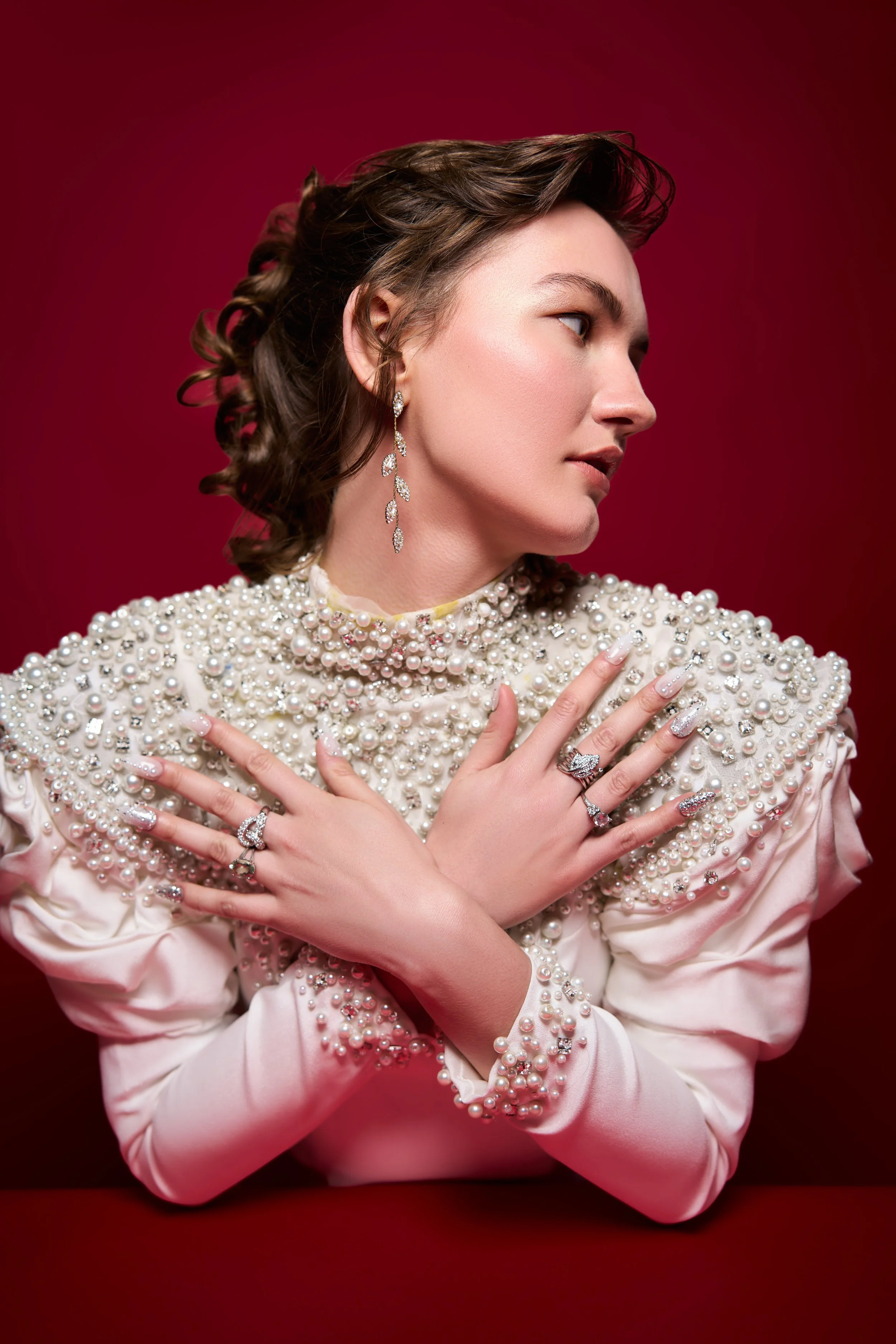
3. Red Creates Attention and Desire
Red is one of the most emotionally intense colors in fashion marketing.
It communicates:
Passion
Energy
Boldness
Sensuality
Confidence
Red naturally attracts attention faster than many other colors.
This makes it highly effective for:
Statement campaigns
Beauty launches
Bold fashion editorials
Luxury eveningwear visuals
Used strategically, red creates immediate visual impact.
4. Neutral Tones Support the “Quiet Luxury” Trend
In 2026, neutral color palettes continue dominating premium branding.
Tones like:
Beige
Cream
Taupe
Soft brown
Warm gray
…create feelings of:
Sophistication
Calmness
Timelessness
Effortless luxury
Quiet luxury aesthetics rely heavily on restrained color use because simplicity often feels more expensive.
This trend has become extremely influential across fashion and beauty campaigns.
5. Blue Builds Trust and Stability
Blue is psychologically associated with:
Reliability
Calmness
Confidence
Trust
Professionalism
Fashion brands often use cooler blue tones for campaigns that want to feel:
Modern
Clean
Intelligent
Structured
Blue works especially well for:
Minimal fashion brands
Corporate luxury aesthetics
Gender-neutral campaigns
Contemporary lifestyle branding
6. Green Signals Freshness and Sustainability
As sustainability becomes more important in fashion, green has gained stronger relevance.
Green often represents:
Nature
Wellness
Organic living
Balance
Conscious consumption
Brands focused on ethical fashion or clean beauty frequently use green-based palettes to reinforce their values visually.
Color can subtly support brand messaging without directly explaining it.
7. Warm Tones Create Emotional Connection
Warm tones such as:
Golden hues
Soft oranges
Warm browns
Sunset-inspired colors
…often feel:
Inviting
Emotional
Human
Nostalgic
These tones create softer emotional storytelling and often perform well for lifestyle-oriented campaigns.
Warm lighting combined with warm palettes can make fashion visuals feel more intimate and relatable.
8. Monochrome Campaigns Feel More Editorial
Many high-end fashion campaigns use limited color palettes intentionally.
Monochromatic styling creates:
Visual cohesion
Sophistication
Editorial identity
Stronger mood consistency
Too many competing colors can make campaigns feel visually noisy.
Controlled palettes often feel more luxurious and fashion-focused.
9. Color Influences Consumer Perception of Price
Color can affect how expensive products appear.
For example:
Deep neutrals and muted palettes often feel premium
Overly bright or chaotic palettes can sometimes feel lower-end depending on execution
Minimal luxury brands often rely on restrained tones to create exclusivity
This is why color selection plays such a major role in fashion positioning.
10. Social Media Has Made Color Strategy Even More Important
Modern audiences experience fashion campaigns through fast-moving digital feeds.
Strong color strategy helps campaigns:
Stand out visually
Feel recognizable instantly
Create stronger emotional memory
Build cohesive branding across platforms
Inconsistent color usage can weaken brand identity significantly.
At Parish Mandhan Photography, we treat color consistency as part of the storytelling process from shoot planning through final editing.
How Parish Mandhan Photography Uses Color Strategically
We approach color as an emotional and branding tool.
Our creative process includes:
Moodboard color planning
Styling coordination
Lighting direction
Background and texture selection
Skin-tone-conscious editing
Fashion-focused color grading
Platform-specific visual consistency
The goal is not simply to create beautiful images.
It is to create campaigns that feel emotionally aligned with the brand identity.
Why This Matters More in 2026
Fashion audiences today are highly visually aware.
Consumers now notice:
Color consistency
Brand mood
Visual storytelling
Emotional aesthetics
The strongest campaigns are no longer only about showcasing clothing.
They are about creating emotional worlds through visual design.
And color is one of the most powerful tools in that process.
Final Thoughts
Color psychology impacts fashion campaigns because color shapes emotion before words ever do.
The right palette can make a brand feel:
Luxurious
Bold
Calm
Modern
Trustworthy
Aspirational
At Parish Mandhan Photography, we believe color is not simply decoration in fashion photography.
It is communication.
Because when color supports the story correctly, campaigns become more memorable, emotionally engaging, and visually powerful.