
Why High-End Brands Avoid Over-Explaining Their Visuals
Some images tell you exactly what to look at. Others leave you looking a little longer.
I have always found the second kind more interesting. In fashion and beauty photography, there are moments when an image doesn't need a headline explaining its mood, a caption describing every detail, or a story spelling out what the viewer should feel. The photograph can hold its own.
That doesn't mean the image has no idea behind it. Usually, the opposite is true. The decisions behind it, the lighting, the styling, the expression, the composition, have been considered carefully enough that the image doesn't need to explain them.
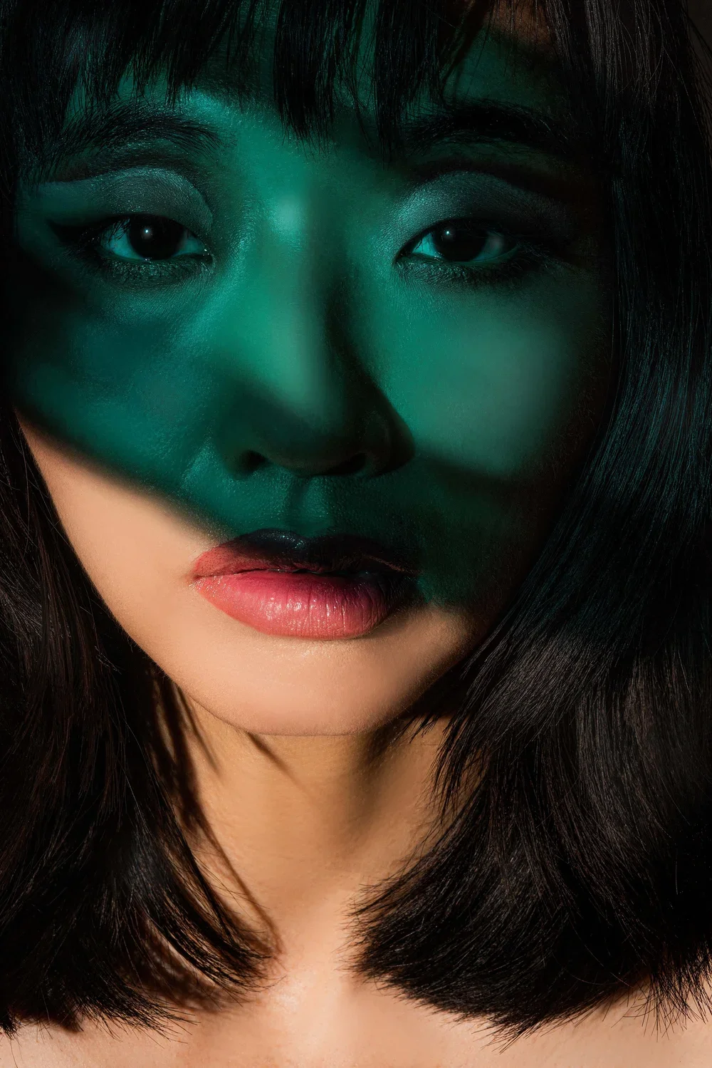
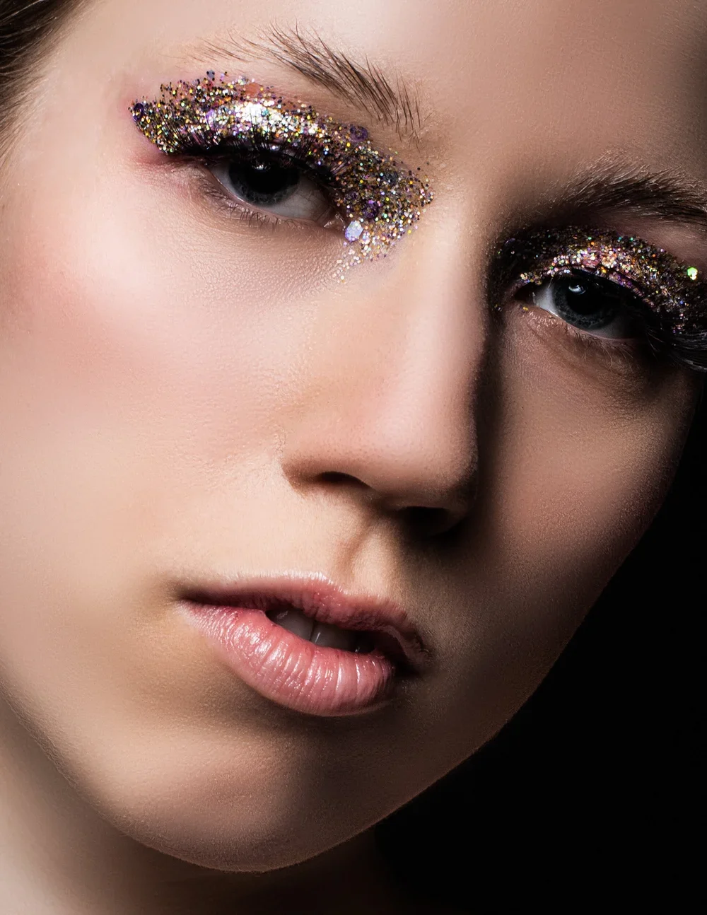
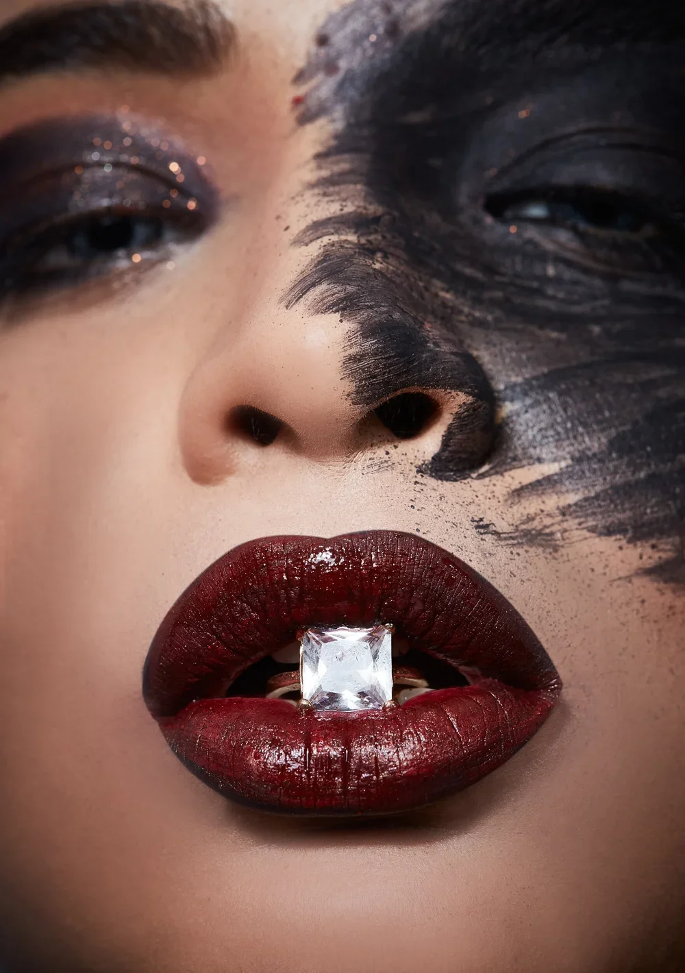
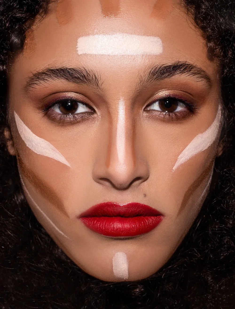
When the image speaks for itself
Think about a beauty portrait. The light catches the cheekbone, the makeup has a particular finish, and the model's expression feels somewhere between direct and distant.
You could add a line explaining that the image is about confidence, softness or desire. But if those qualities are already present in the photograph, the words might only make the experience smaller.
For me, a strong image creates a feeling before I have time to put a name to it.
This is where restraint becomes part of the creative direction. It is not about removing information at random. It is about recognising which details are essential and allowing the rest to stay quiet.
The difference between mystery and confusion
There is a fine line between leaving something open to interpretation and making an image difficult to understand.
A photograph can be subtle without being vague. The clothes should still be visible when they matter. The beauty look should still come through. The composition should give the viewer somewhere to begin.
What can remain open is the feeling around those details.
A model looking away from the camera doesn't necessarily need to be described as mysterious. A shadow across the face doesn't need to be explained as dramatic. Sometimes, the viewer will see something different from what I saw while making the image — and that is part of what makes photography interesting.
The goal isn't to make the viewer guess what the photograph is about. It is to give them enough to connect with, without deciding the entire experience for them.
Why restraint feels considered
High-end visual communication often depends on a sense of control. Not everything is competing for attention at once.
A restrained image might have a simple background, a carefully chosen colour palette and a single detail that draws the eye. The styling doesn't have to be minimal, and the lighting doesn't have to be soft. What matters is that each element has a reason to be there.
When too many things are trying to communicate at the same time, the image can lose its focus. The viewer starts noticing the effects rather than the idea behind them.
I think this is why a simple frame can sometimes feel more powerful than an elaborate one. It gives the subject room to exist.
The role of words in a visual campaign
Words still matter. A campaign needs to communicate its product, its identity and sometimes a very specific message.
But there is a difference between giving an image context and explaining the image itself.
A short campaign line can introduce a new idea or add another layer to the photograph. A product description can provide information that the image cannot. Those are useful roles for language.
What I try to avoid is using words to tell the viewer what they should already be able to see or feel.
If the styling, lighting and expression have done their work, the copy can be simpler. It can sit alongside the image rather than compete with it.
Knowing what to leave out
This is often one of the more difficult parts of creative direction.
During a shoot, there can be so many ideas worth trying: another colour, another prop, a different pose, a new lighting effect. Some of them may be beautiful on their own, but not every beautiful detail belongs in the final image.
Editing is where the visual direction becomes clearer. It is the point where I ask whether an element is helping the photograph or simply giving it more to say.
Sometimes the answer is to remove something. Sometimes it is to keep the image exactly as it is.
The same thinking applies to the final campaign. Not every photograph needs a long caption. Not every image needs to be followed by another image immediately. Giving a strong frame a little space can be just as important as making it.
Letting the viewer come closer
The images I tend to remember are rarely the ones that explain everything.
They might have an expression I can't quite place, a colour that feels unexpected, or a small detail that becomes more interesting the longer I look at it. They leave room for a personal response.
That is what I find valuable about restraint in fashion and beauty photography. It allows the photograph to be more than a message delivered in a frame.
A visual doesn't have to tell the viewer everything. It just has to give them a reason to stay.