
Color Psychology in Beauty Shoots: Shades That Influence Emotions
In beauty photography, details matter, the glow of skin, the precision of makeup, and the way light interacts with every texture. But there’s another element that plays a powerful, often subconscious role: color. The shades used in a beauty campaign don’t just look appealing, they influence how audiences feel and respond.
At Parish Mandhan, I approach every beauty shoot with color psychology in mind, ensuring that shades amplify emotions and align with brand identity. In today’s competitive beauty market, this can make the difference between a campaign that’s simply beautiful and one that’s unforgettable.


The Science of Color Psychology in Beauty Shoots
Color psychology explores how different hues affect human emotions and perceptions. From trust-building blues to passionate reds, the right palette can completely transform how an audience experiences your campaign.
In beauty photography, colors work in two key ways:
Product Communication – Lipsticks, eyeshadows, and skincare packaging all carry emotional cues through color.
Visual Atmosphere – Backdrops, lighting gels, and wardrobe styling contribute to the overall emotional tone.
Shades That Influence Emotions in Beauty Photography
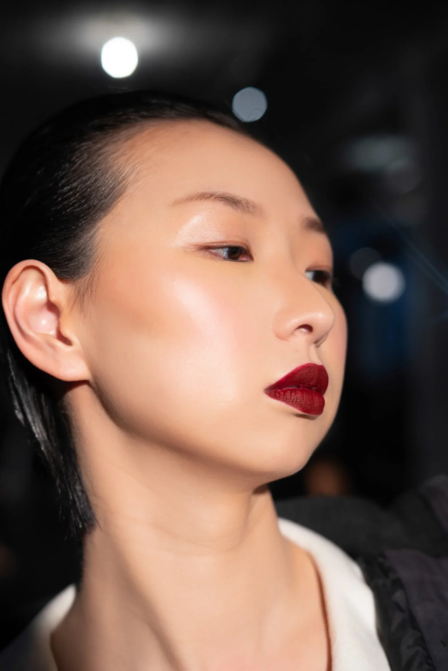
Red: Passion & Power
Perfect for bold lip campaigns or high-energy editorials.
Conveys strength, confidence, and sensuality.
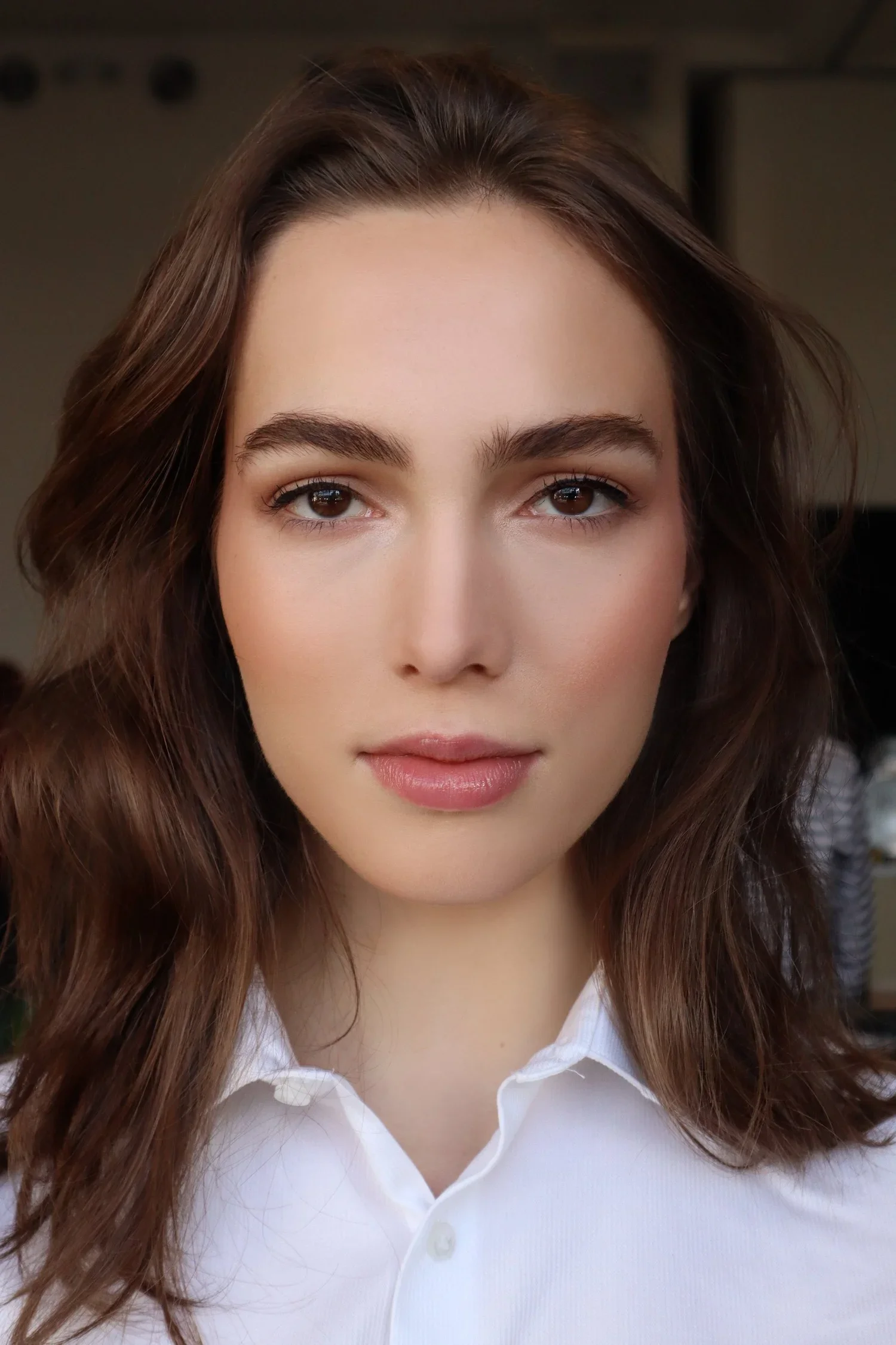
Pink: Femininity & Playfulness
Often used in beauty campaigns targeting youthful and vibrant audiences.
Works well for skincare and soft glam looks.
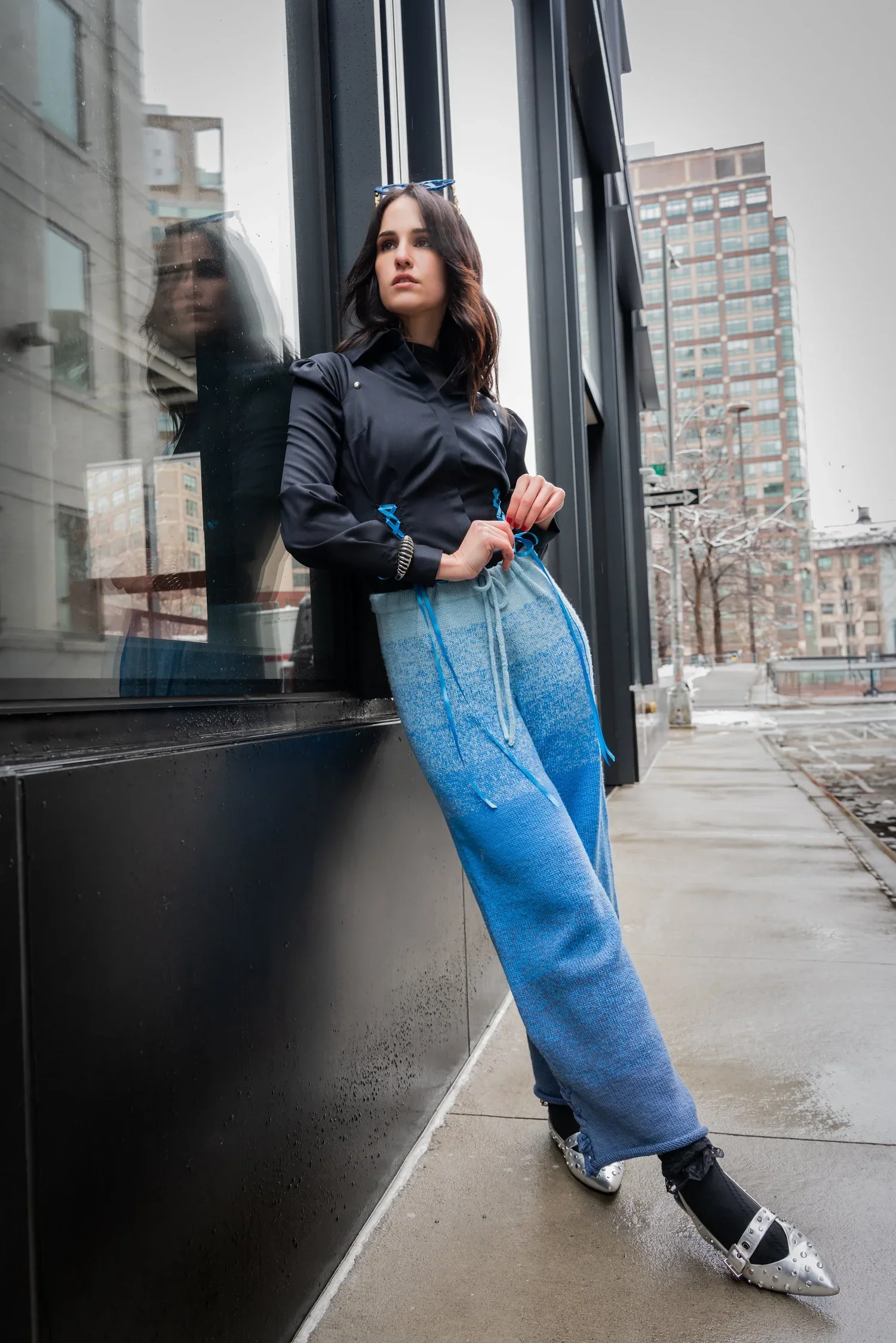
Blue: Trust & Serenity
Popular in skincare shoots for its calming, clean associations.
Suggests freshness and reliability, ideal for wellness-driven brands.
Gold: Luxury & Glamour
Instantly elevates the campaign into the high-end, aspirational category.
Often used in luxury fragrance or holiday beauty shoots.
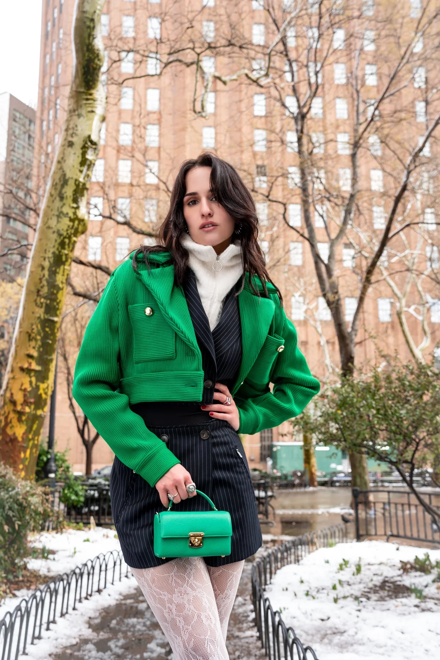
Green: Nature & Renewal
Perfect for organic beauty brands or clean skincare lines.
Evokes harmony, balance, and eco-consciousness.
Black & White: Modernity & Timelessness
Striking monochrome campaigns emphasize sophistication.
Great for high-fashion beauty editorials and luxury brand storytelling.
Using Color Psychology Strategically in Campaigns
Align with Brand Identity: A brand that champions sustainability should lean toward greens and earth tones, while a luxury line may favor gold and deep jewel tones.
Know Your Audience: Different age groups and demographics respond uniquely to colors.
Balance Subtlety & Boldness: Neutral backgrounds let beauty products shine, while bold pops of color grab attention on digital platforms like Instagram and TikTok.
Why NYC Is the Perfect Backdrop for Color-Driven Beauty Photography
New York City is a canvas of colors, from the sleek monochrome of downtown lofts to the neon vibrancy of Times Square. Shooting in NYC allows beauty campaigns to play with both minimal palettes and bold, experimental tones, depending on the brand’s vision.
Conclusion: Painting Emotion Through Color
In beauty photography, color isn’t just decoration, it’s storytelling through shades. The right palette doesn’t just catch the eye; it influences emotion, builds trust, and creates desire.
Ready to craft a beauty campaign that resonates emotionally and visually? Let’s collaborate to create color-driven photography that makes your brand unforgettable.